What does it mean?
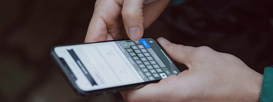
It’s been a while since we started hearing the term mobile first not just in software mobile development circles, but also in marketing, design and even C-level management. We all know and it’s made pretty clear that “the future is mobile” and everyone that wants to have a website or a software application should know by now that what it really means is “the present is mobile”.
In this day and age if your website or application does not adapt to a mobile screen you are going to lose a huge amount of traffic simply because the regular user expects their pocket device to be able to handle everything a computer can do, so it’s no surprise that they will leave instantly if the application does not handle well on their phone.
By saying this, the mobile first philosophy dictates that you should focus on creating an experience based on the capabilities of a smartphone and the way users handle their screen. While it’s true that a smaller screen could be considered a limitation for designers, in practice it actually helps you to simplify the functionality of your website or application by eliminating any noise that isn’t the primary focus of the app. Screen size is something that could be bothersome if you didn’t start designing with this mobile philosophy, as it could be hard to transform a PC tailored app into a small screen because the functionality was not built around it.

Added value or norm?
I think it’s safe to say that a decade ago having your application work on your brand new iPhone 3G was clearly an added value and you could proudly mention to your friends that you have your website running smoothly on an iphone screen. That’s not true today as I firmly believe that this has become a true norm for every website or software application, we went from a “nice to have” feature to an expected one in a decade, which tells us how much we need to keep adapting to the latest tech trends and preferably spearheading new features that will someday become a norm.
Mobile first has become such a norm that in order to keep up, even low-end laptops come prepared with GPS (location features), Bluetooth and some kind of AI assistant. Which at first were features that came on your smartphone and it really wasn’t a norm for a personal computer to include them. Some computers now even include data and phone plans that go beyond VoIP. This is a clear example of how a Mobile first philosophy has impacted the industry outside of the smartphone, as more applications made use of those features the standards for personal computers features also went up.
Conclusion
Nowadays we all expect to use our phones as a personal computer, so it makes complete sense to develop software applications and websites with mobile web development in mind. When you start designing with all the features a smartphone has you are adopting a mobile first philosophy and to everyone’s surprise, computers adapted to this and now it’s clear why that wasn’t a mistake.
So, even if your analytics show that only 20% of the people visiting your website or using your software application are doing it via phone, it’s safe to say that it’s expected for it to just work, your target audience may be inclined to use a certain device but not having it adapted to every screen could impact you negatively and potentially lose customers or users that were interested in it but were discouraged when they figured that it doesn’t work on their phones.